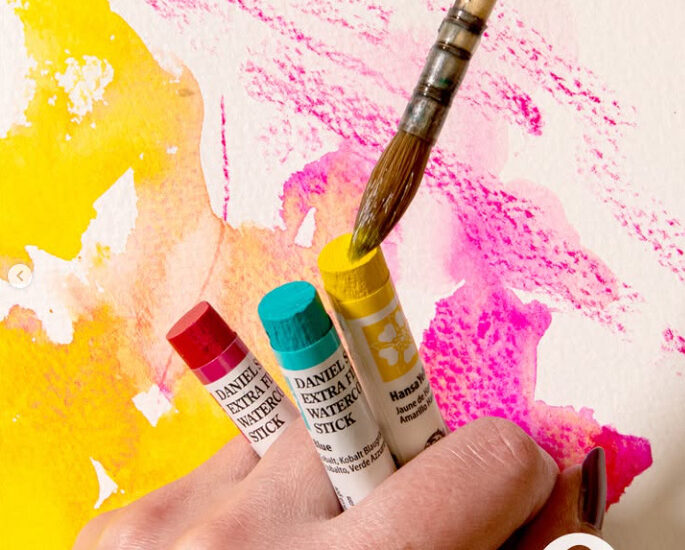
Unlocking the Potential of French Ultramarine
French Ultramarine is one of the most essential colours in a watercolourist’s palette. With its deep, warm blue and slight reddish undertone, it is perfect for mixing and creating a vast range of hues, from atmospheric skies to rich shadows and earthy neutrals. This single pigment granulates beautifully and creates dramatic textures when paired with other colours. In this article I will take you through a selection of colour mixing options and give you ideas on how to use them.
French Ultramarine is a relatively modern pigment
French Ultramarine is a relatively modern pigment synthetically made from a mixture of aluminosilicate, sodium carbonate, silica and sulphur. This synthetic alternative was created by a French chemist J.B. Guimet in 1824. Up until that point Ultramarine was sourced from rare lapis lazuli rocks which meant it was prohibitively expensive. Nowadays French Ultramarine is made from a single pigment PB29 and is a staple in most artists palettes. You may see paints labelled as Ultramarine and Ultramarine (Green Shade) and whilst these are made with the same pigment as French Ultramarine they are cooler in tone. For the purposes of this article I have used Winsor & Newton Professional watercolour in French Ultramarine and all mixing examples shown use Winsor & Newton watercolours, which are known for their consistent quality and performance in watercolour painting.
Exploring Watercolour Colour Mixing with French Ultramarine

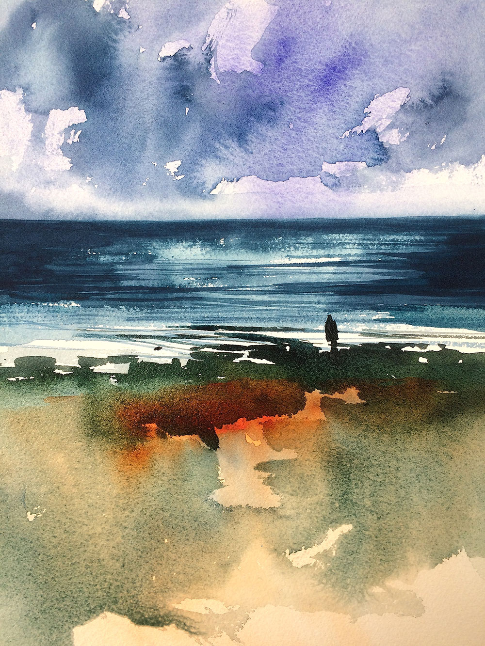
French Ultramarine has a beautifully, strong granulating effect, which means the pigment particles settle into the texture of the paper, creating a natural granulated appearance. This is especially useful in watercolour painting because it adds texture to skies, water, rocks and trees. Used diluted, on its own, it helps create the illusion of distance and atmospheric perspective – great for distant hills and mountain ranges.
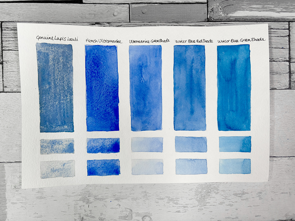
French Ultramarine is a warm alternative to other blues. Looking at the image above you can see that Winsor Blue/Phthalo Blue is cooler and more intense than French Ultramarine which is softer and more natural. Cerulean Blue is lighter and more turquoise whereas French Ultramarine is deeper. Finally Cobalt Blue is softer and more neutral, while French Ultramarine is warmer and more punchy. French Ultramarine is often chosen for skies at dusk or early morning as the granulation mimics the natural diffusion of light in the atmosphere. Whereas Cerulean or Winsor/Phthalo Blue might be used for midday skies.
French Ultramarine is perfect for mixing with other colours to create a vast range of hues. With only one other colour it creates deep blues, natural greens, rich or dusky purples and earthy greys and browns. French Ultramarine is one of the best colours for creating depth in landscapes, thanks to its ability to recede into the background when mixed with warm earth tones.
Colour mixing with French Ultramarine (PB29)
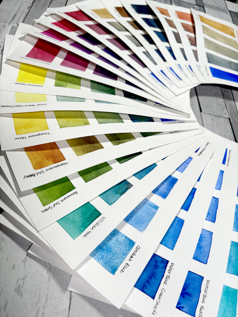
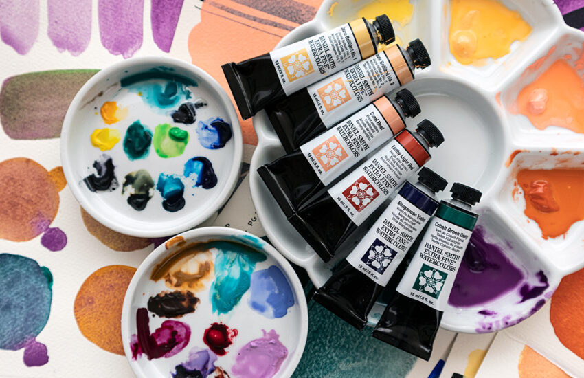
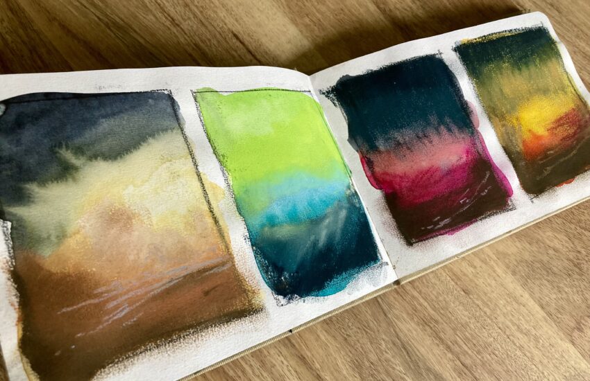
So let’s now take a closer look at the colour mixing possibilities with other colours you may have in your palette.
I have created a series of swatches below. French Ultramarine is painted out at 100% in the left hand box and the other colour being mixed is swatched on the right hand box again at 100%. The two smaller boxes below these illustrate how the pigment behaves with more water added to the wash. I have then started to add another colour to the French Ultramarine wash. The three middle boxes illustrate how the wash transitions from French Ultramarine as increasing amounts of the other colour are added. The middle box is 50% French Ultramarine and 50% the other colour.
I have added pigment numbers for those artists familiar with this system. It is important to understand that a pigment number primarily indicates the chemical composition of the pigment, not necessarily how the paint will look or behave. Manufacturers influence a pigment’s final appearance by adjusting how they process it, altering the proportions of ingredients, or changing the grinding method. For instance, pigments like PV19, PBr7, PR101 and PB36 can vary greatly in hue, tint strength and other characteristics due to these manufacturing choices. While pigment numbers are a helpful guide, they don’t identify a consistent paint colour.
1. Expanding the Blue Spectrum
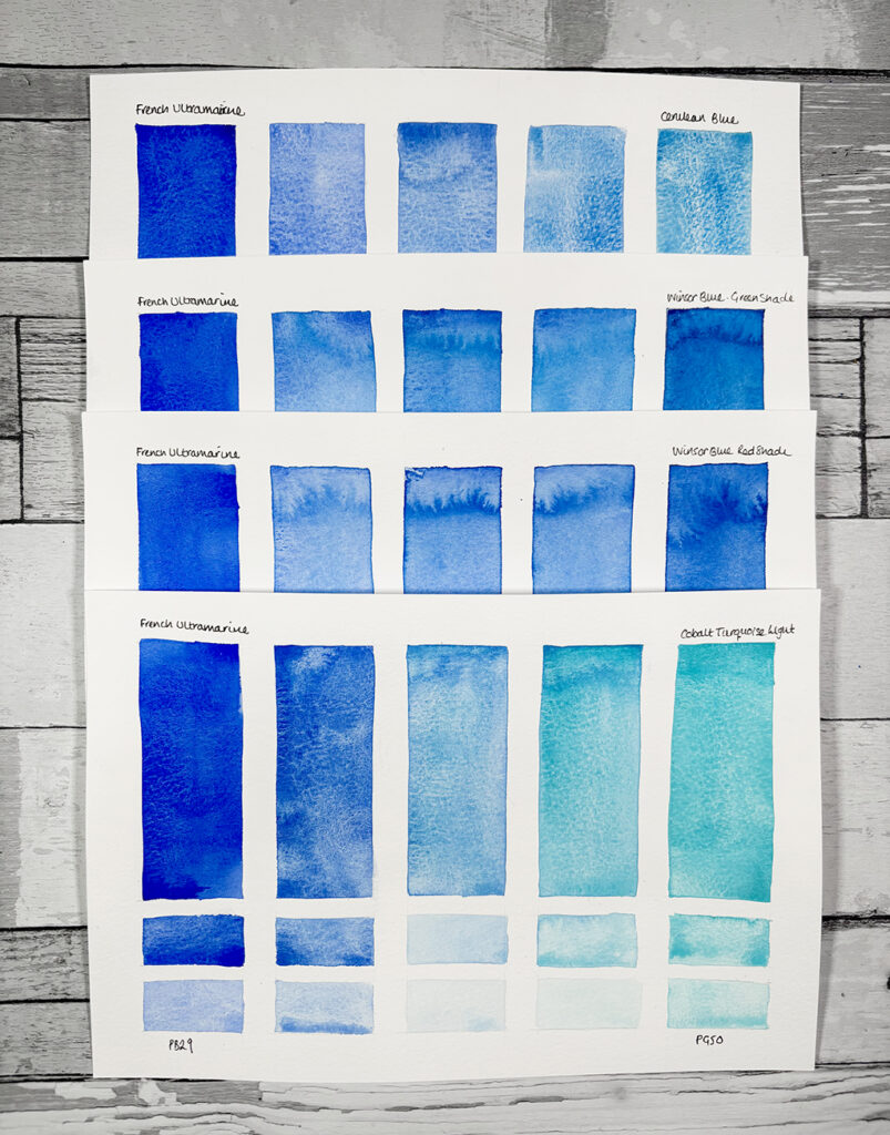
French Ultramarine is a strong blue on its own, but mixing it with other blues allows for even more range as the image above shows.
French Ultramarine + Cerulean Blue (PB35)
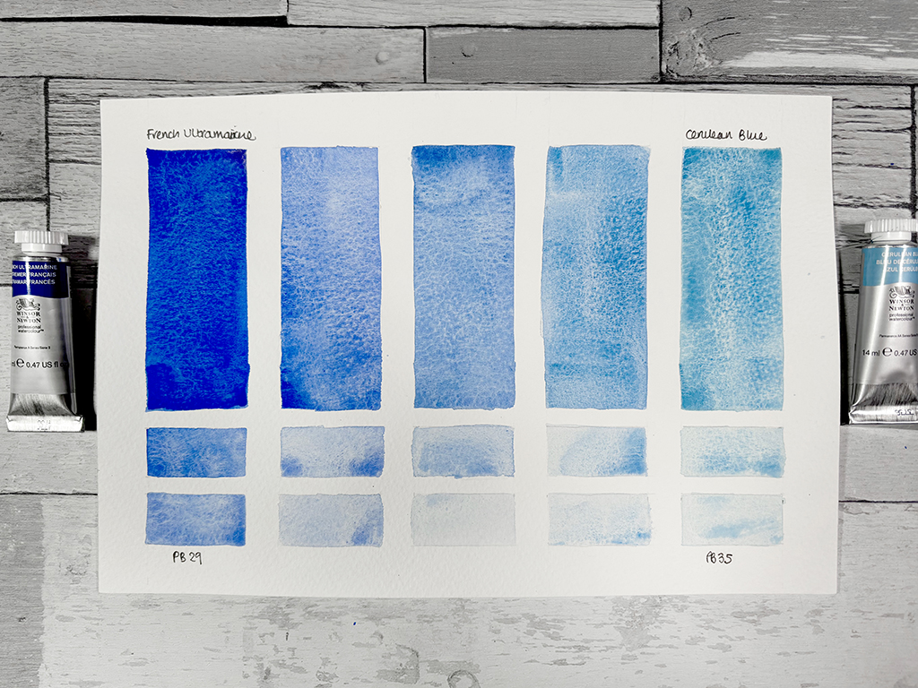
Result: a super-granulating mix and one of my favourites! Soft delicate blues.
Use: ideal for painting airy summer skies and distant horizons.
French Ultramarine + Winsor Blue/Phthalo Blue (PB15)
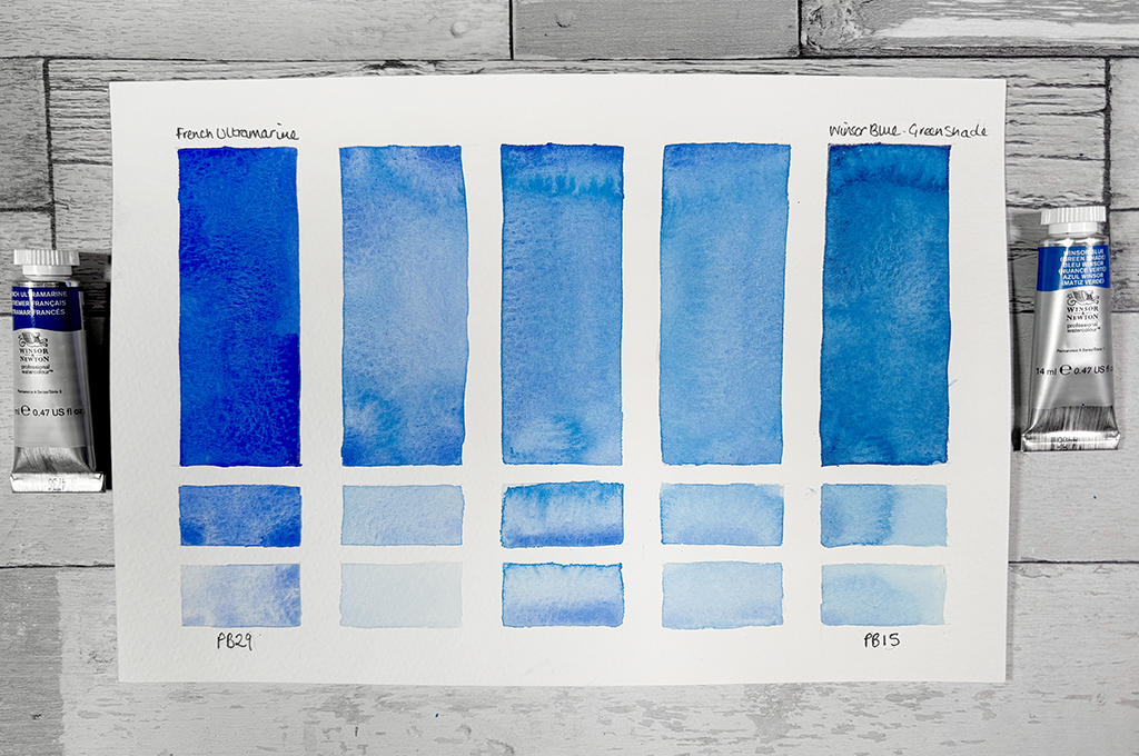
Result: increases the intensity of hue. Winsor & Phthalo Blues are transparent and highly staining in nature which means they do not lift easily. Exploit this feature as it allows for transparent layering (glazing) without disturbing underlying layers.
Use: great for deep ocean blues, bold stormy skies, and vibrant reflections in water.
French Ultramarine + Cobalt Turquoise Light (PG50)
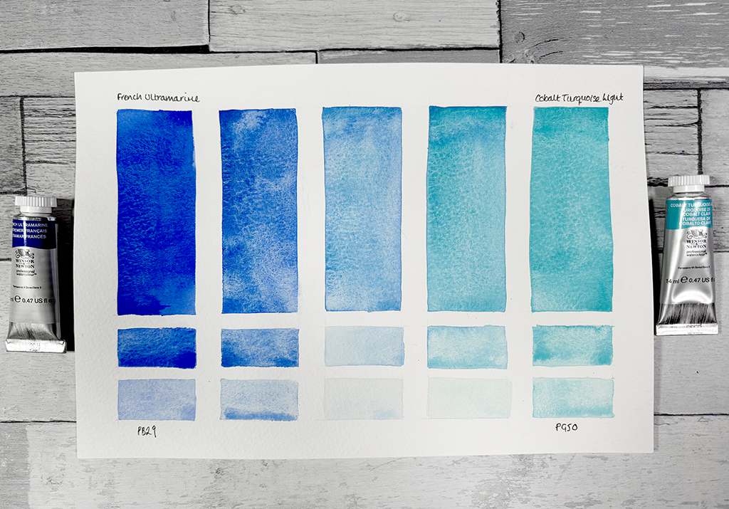
Result: another super-granulating mix to add texture to your painting. Cobalt Turquoise is a semi-opaque pigment so exploit this feature to create hazy and dusky textures.
Use: Tropical seas, distant hills, hazy horizons when diluted.
2. Creating Lush Greens

Though French Ultramarine is warm, you are still able to create natural and muted greens when you mix it with yellows or greens. The image above shows the range of greens that can be mixed and I will now go through each mix individually;
French Ultramarine + Cadmium Lemon (PY35)
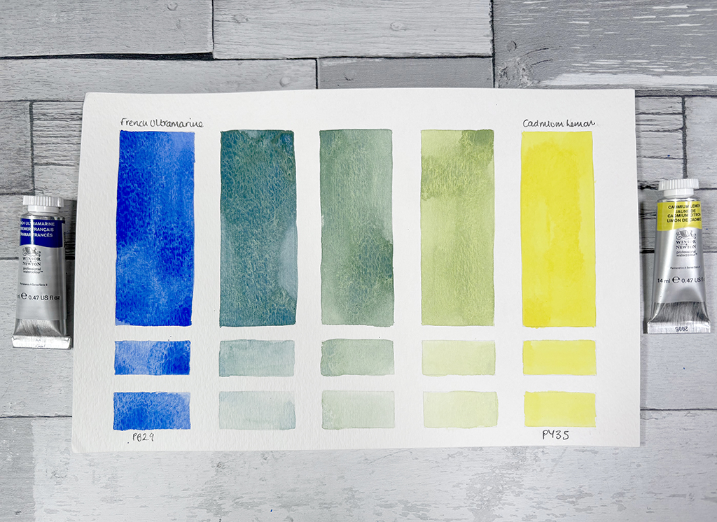
Result: vibrant fresh greens
Use: perfect for vibrant spring foliage, sunlit grass, fresh fields.
French Ultramarine + Lemon Yellow Nickel Titanate (PY53)
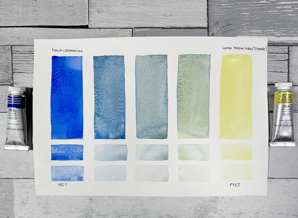
Result: bright fresh greens to deep sea blues
Use: with predominantly more yellow than blue it is perfect for spring foliage and sunlit grass. Using more blue in the mix creates beautiful sea greens with a striking settling wash. This yellow appears opaque straight from the tube, but can be lifted cleanly. The mixes it creates are similar to Cadmium Lemon but with the ‘zing’ taken out, so if you are after something more subtle this is the mix for you.
French Ultramarine + Transparent Yellow (PY150)
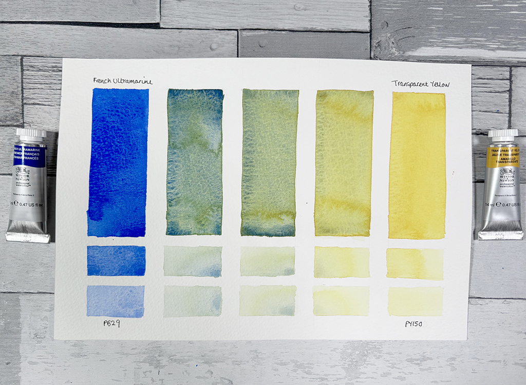
Result: bright mid greens with a beautiful granulated texture.
Use: Transparent Yellow is bright clean yellow colour. In contrast to Lemon Yellow and Cadmium Yellow, which are both opaque, it is a transparent colour with strong staining properties. This means that the colour cannot be completely lifted from the paper. Use this to your advantage for glazing colours on top or for lifting to create brighter highlights in foliage.
French Ultramarine + Transparent Gold Deep (PR179,PV19,PY153)
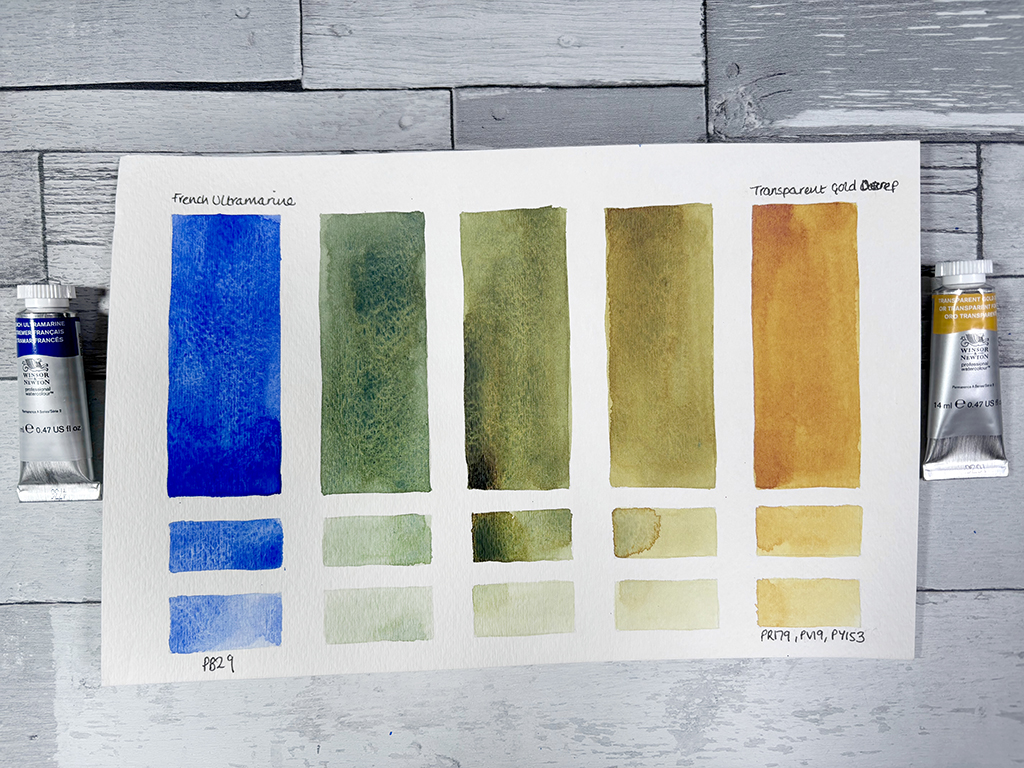
Result: earthy, olive and moss greens.
Use: Transparent Gold Deep is Winsor & Newton’s replacement for Quinacridone Gold. Transparent Gold Deep is a dark golden yellow colour with staining properties. A great mix for foliage and autumnal landscapes.
French Ultramarine + Permanent Sap Green (PG36 & PY110)
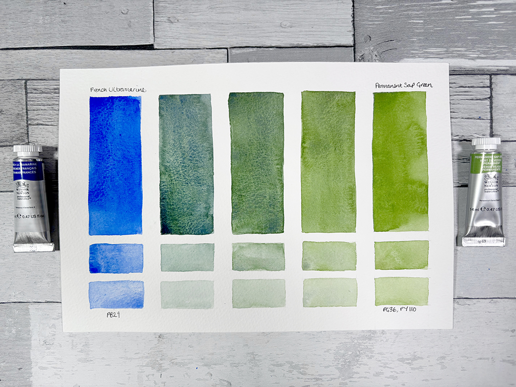
Result: enhances greens, making them richer and deeper
Use: lush forests and dense greenery, trees in a late summer landscape. As Permanent Sap Green is staining, passages of lighter foliage can be lifted out.
French Ultramarine + Viridian Hue (PG7 & PY42 & PY48)

Result: creates deep, moody teal shades
Use: ideal for pine forests or shadowed foliage. distant hills fading into mist. Strong water reflections.

3. Mixing Beautiful Purples & Violets
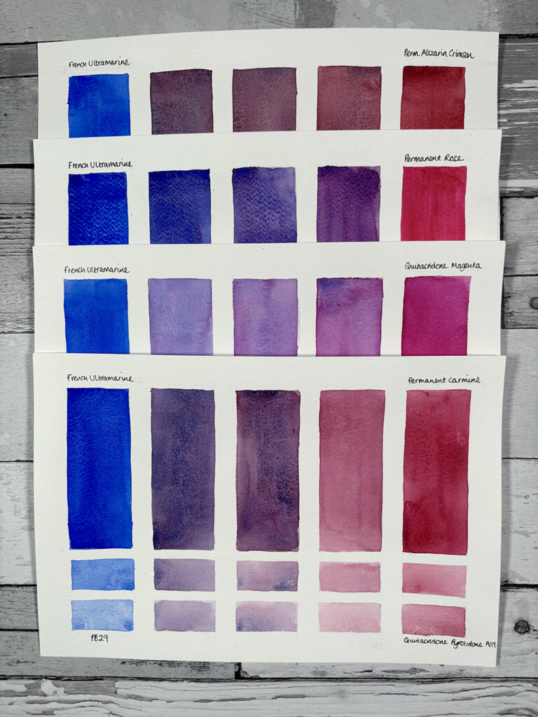
French Ultramarine naturally leans toward violet, making it an excellent choice for a variety of purple shades:
French Ultramarine + Permanent Alizarin Crimson (PR179)
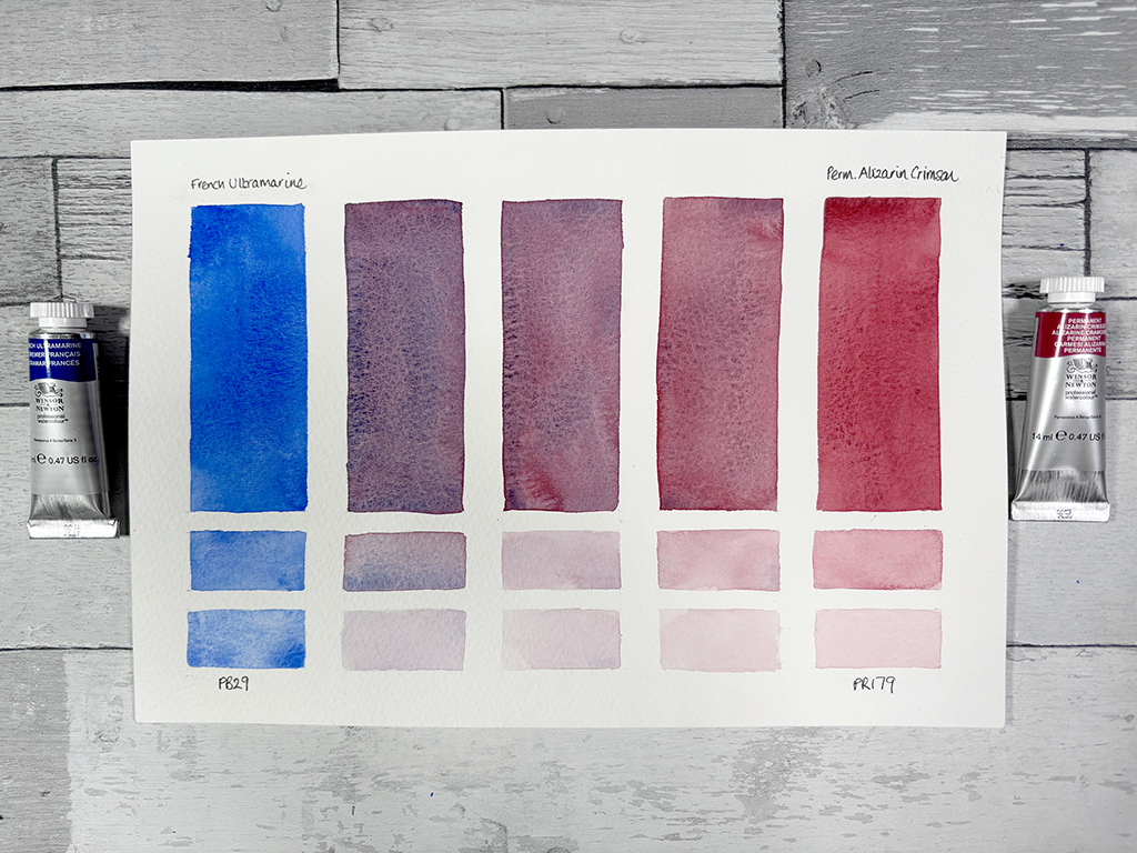
Result: deep, dramatic reddy purples.
Use: great for stormy skies or twilight tones in landscapes. In winter scenes, it helps define snow shadows.
French Ultramarine + Permanent Rose (PV19)
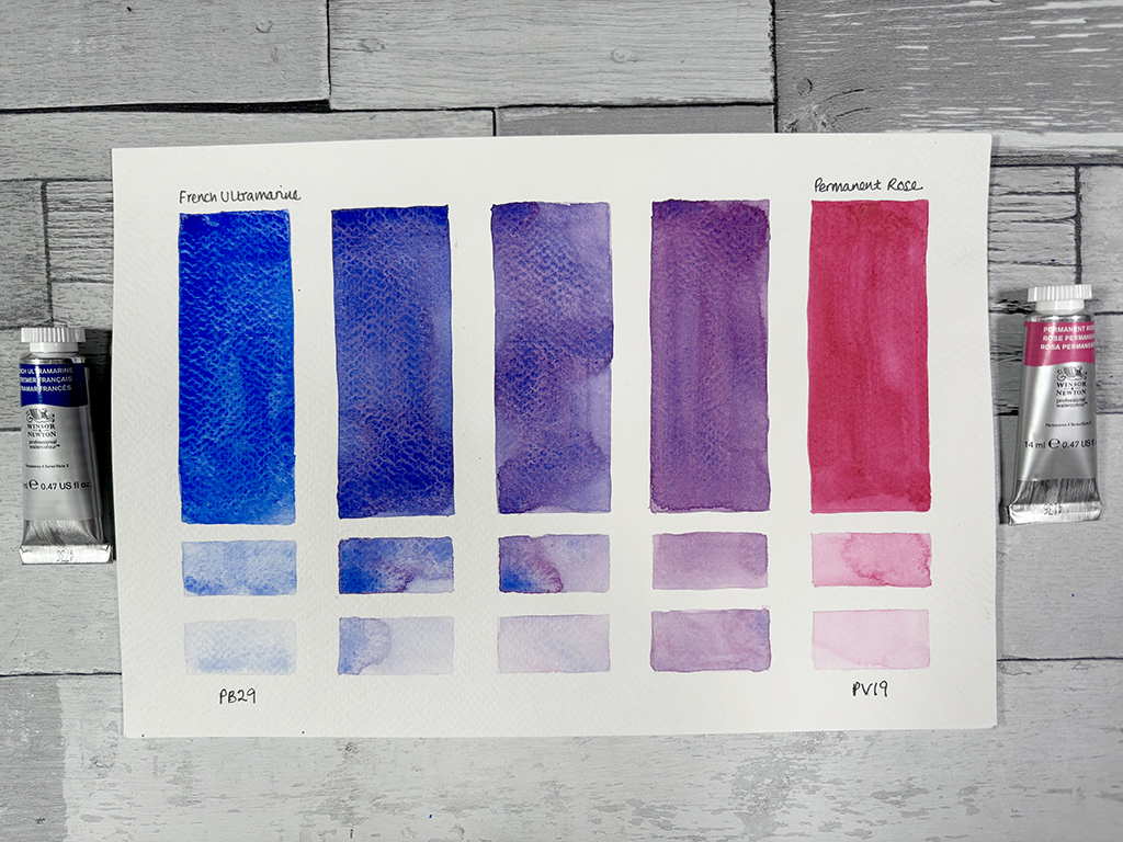
Result: vibrant, rich violets
Use: ideal for floral paintings, particularly irises, lavender fields, or wisteria.
French Ultramarine + Quinacridone Magenta (PR122)
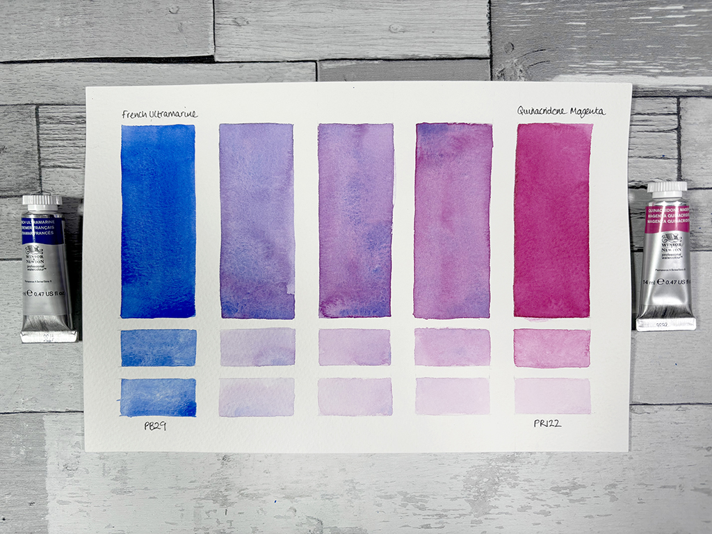
Result: by adding different amounts of each pigment, you can create a spectrum of purples, from cool, blue-leaning purples to warmer, red-leaning purples.
Use: floral paintings, moors of heather, twilight skies.
French Ultramarine + Permanent Carmine (PV19)
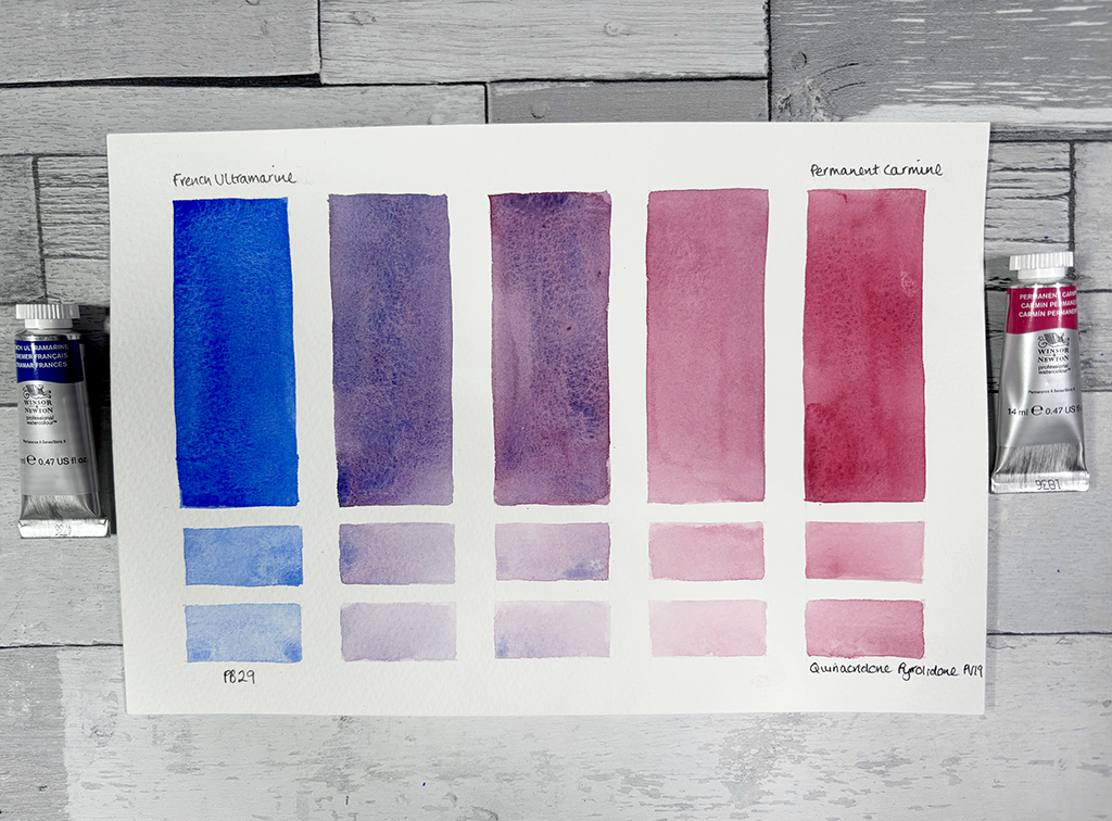
Result: muted, dusky purples. Using French Ultramarine in smaller quantities neutralises the red of the Permanent Carmine.
Use: perfect for mountain shadows and atmospheric haze.
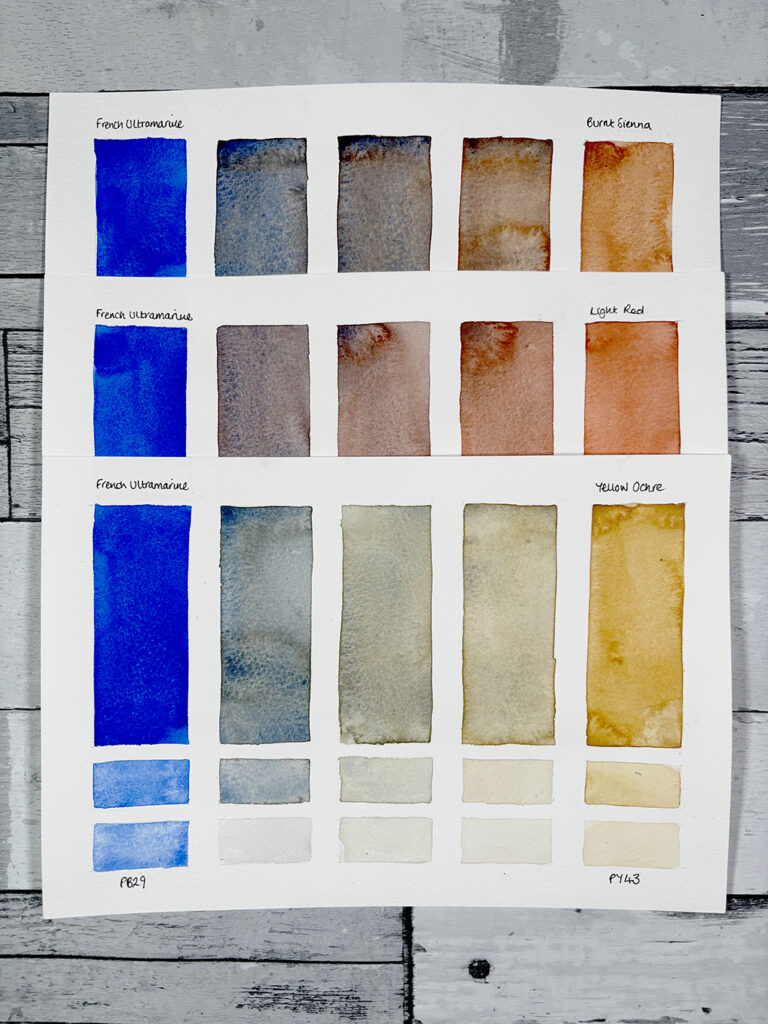
4. Crafting Rich Earth Tones & Neutrals
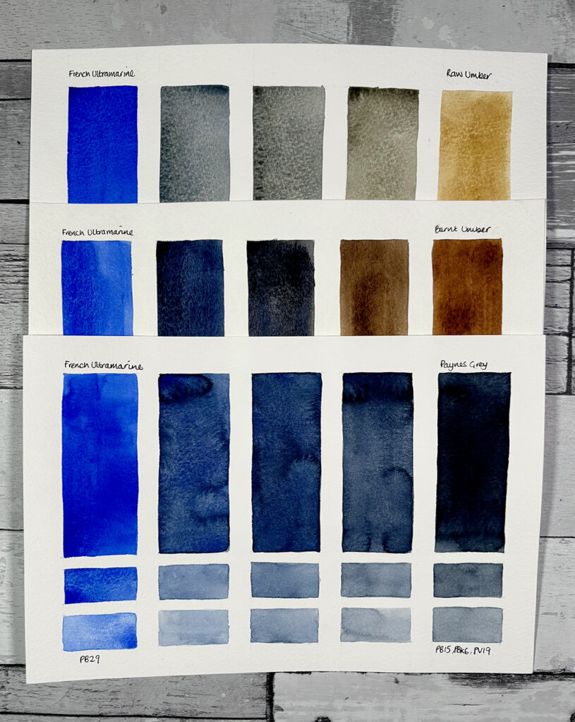
One of the most valuable aspects of French Ultramarine is its ability to create soft, natural neutrals as shown above, here’s a more detailed look:
French Ultramarine + Raw Umber (PBr7)
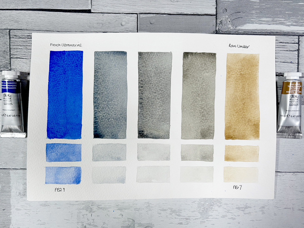
Result: produces a cool, muted browns and neutral grays.
Use: perfect for tree bark and rustic wooden elements and to add depth to rocky cliffs.
French Ultramarine + Burnt Umber (PBr7,PR101,PY42)
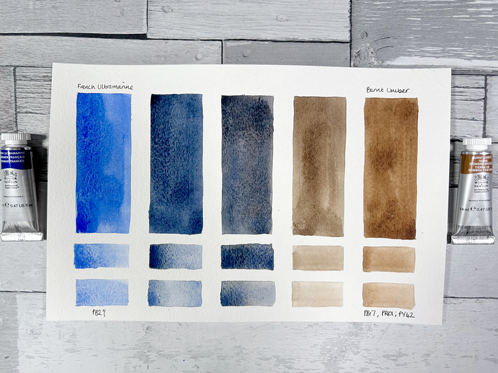
Result: if you are a seasoned artist this mix will be one of your go to mixes, especially if you are working in oils. It works equally well for watercolours creating a range of browns, deep blues and a softened black.
Use: storm clouds dark shadows.
French Ultramarine + Paynes Grey (PB15,PBk6,PV19)
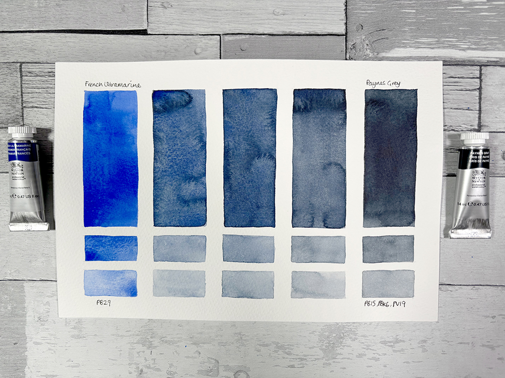
Result: enhances the depth of French Ultramarine to produce dark textured blues through to deep greys.
Use: excellent for stormy skies, dramatic mountain peaks, shadowy corners and deep water reflections. Useful for representing snow shadows in winter landscapes.
5. Portrait Tones
Although blue isn’t typically thought of as a colour for skin tones, French Ultramarine plays a crucial role in neutralising warm hues and adding depth to shadows.
French Ultramarine + Burnt Sienna (PR101)
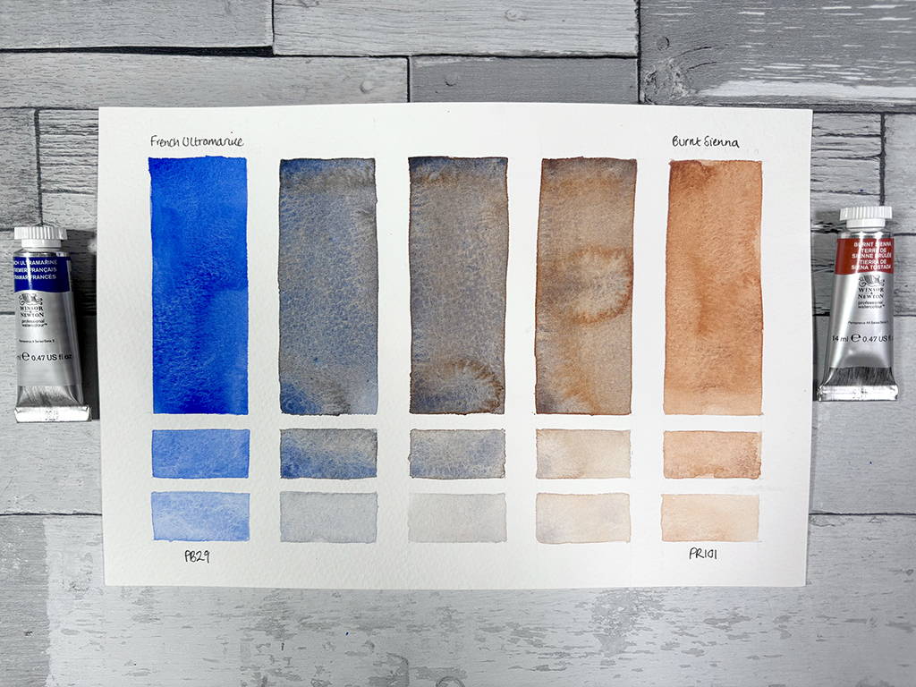
Result: balanced greys.
Use: In portraits, it creates cool, natural shadows. Use it for natural shadow colour on the face, especially around the eyes, nose, and under the chin. In landscapes this mix is great for misty scenes, cloud shadows, and old stone walls. Distant mountains appear hazy and soft when mixed with Burnt Sienna.
French Ultramarine + Light Red (PR102)
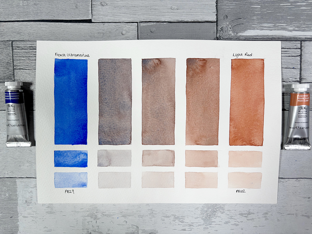
Result: muted violets and browns, ideal for capturing the warmth in skin.
Use: ideal for capturing the warmth in skin.
French Ultramarine + Yellow Ochre (PY43)
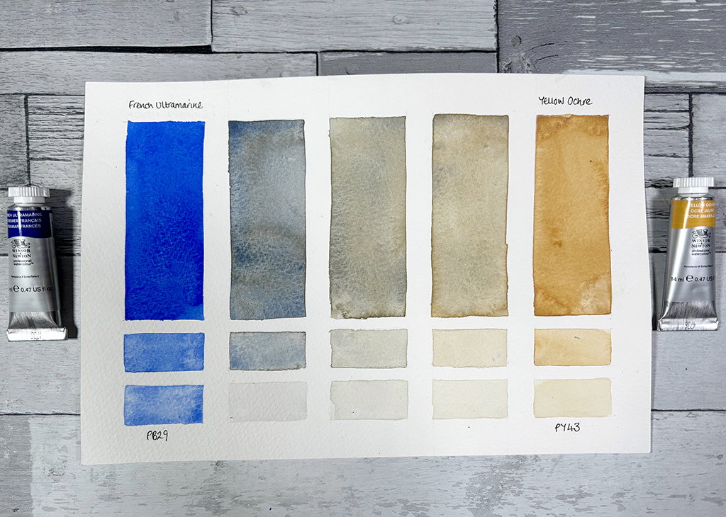
Result: softens into a gentle, natural grayish-blue.
Use: perfect for underpainting cool skin shadows.
Why Every Artist Needs French Ultramarine
French Ultramarine itself has a beautiful granulating quality, adding interest and texture to skies, water, and landscapes. It also builds well in transparent washes, making it great for layering depth and atmosphere. On top of that it is an indispensable mixing colour. We have discovered it can extend your blue range and also create a wide array of deep violets and greens, neutral greys and earthy browns. So whether you’re painting skies, seas, forests, mountains, or portraits French Ultramarine unlocks a world of possibilities with just a few additional colours. If you’re building your watercolour palette or want to explore colour mixing ideas using Winsor & Newton watercolours, French Ultramarine is a foundational choice.
I hope you enjoyed exploring this colour, if you find any new exciting combinations please let me know and drop me a comment below.
Finally, if you would like to find out more about the history of French Ultramarine you might find this article interesting ‘Artists’ Pigments: The History of Ultramarine‘.