
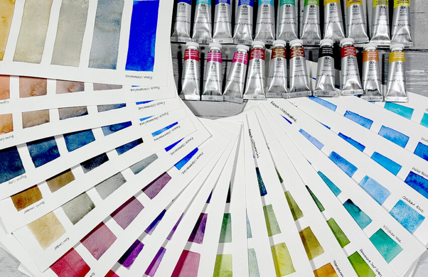
We Test Rosa’s 10 Vibrant New Watercolour Shades
The latest 10 colours in the Rosa Gallery Watercolour range have landed on UK shores. Including a selection of colours with enhanced granulation, as well as palette essentials and colours based on natural pigments, these new colours include a hue for every artist. We put the new colours to the test to see what exciting opportunities they open up for watercolour artists.
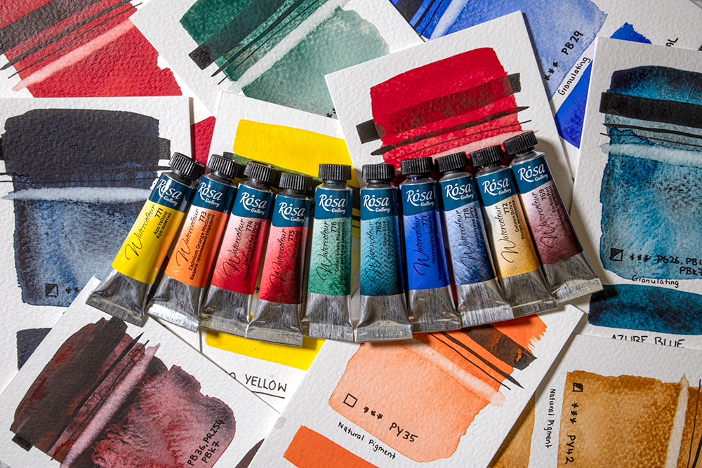
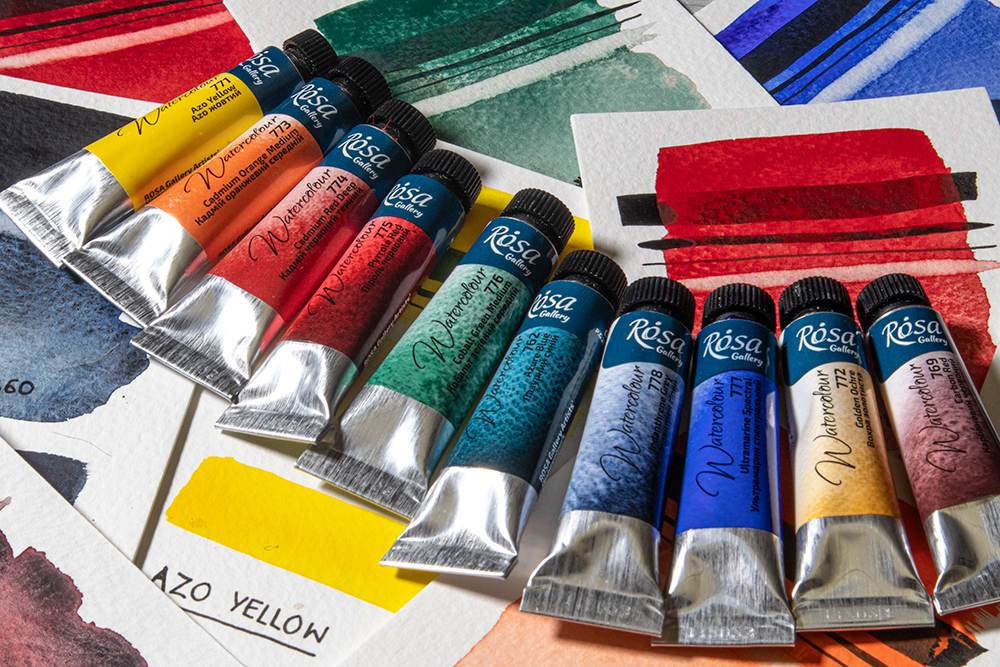
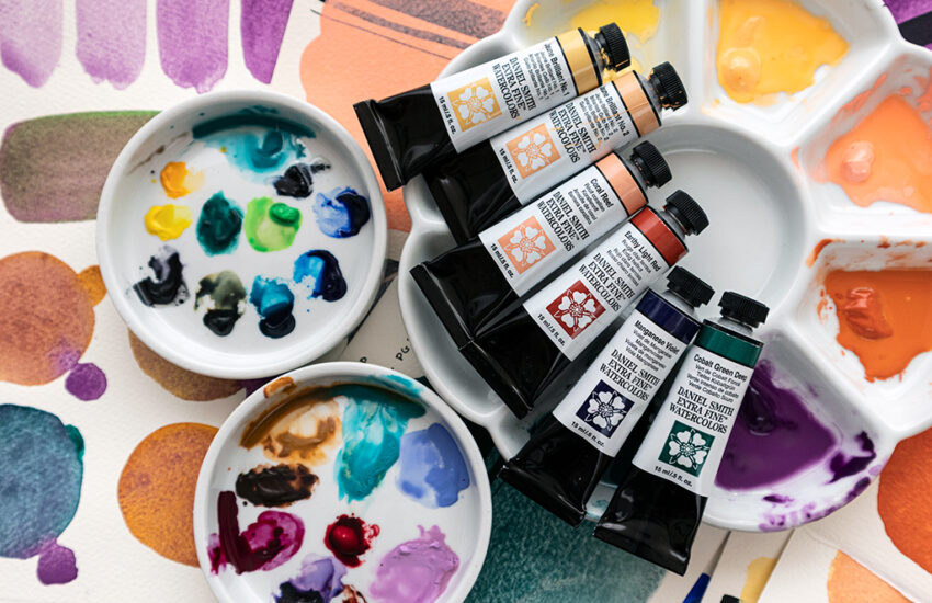
Rosa Gallery Watercolour Paints have been incredibly popular since we first introduced them to our range in Autumn 2022. They offer a fantastic range of affordable paints that has grown from a palette of 70 colours to 80 with the addition of these latest 10 colours. These new arrivals include 8 single pigment colours, 6 granulating hues – with 4 of those being super granulating – and 4 colours made using natural pigments. These new colours see Rosa expanding their offering of some palette essentials – like 2 cadmiums and a cobalt – along with a selection of more experimental colours. There’s a great mixture of classic and specialist colours. Perfect for painters of all subjects whether you’re a landscape painter, botanical illustrator, abstract artist and more! We put them to the test to see what magic they can bring to your palette.
Azo Yellow
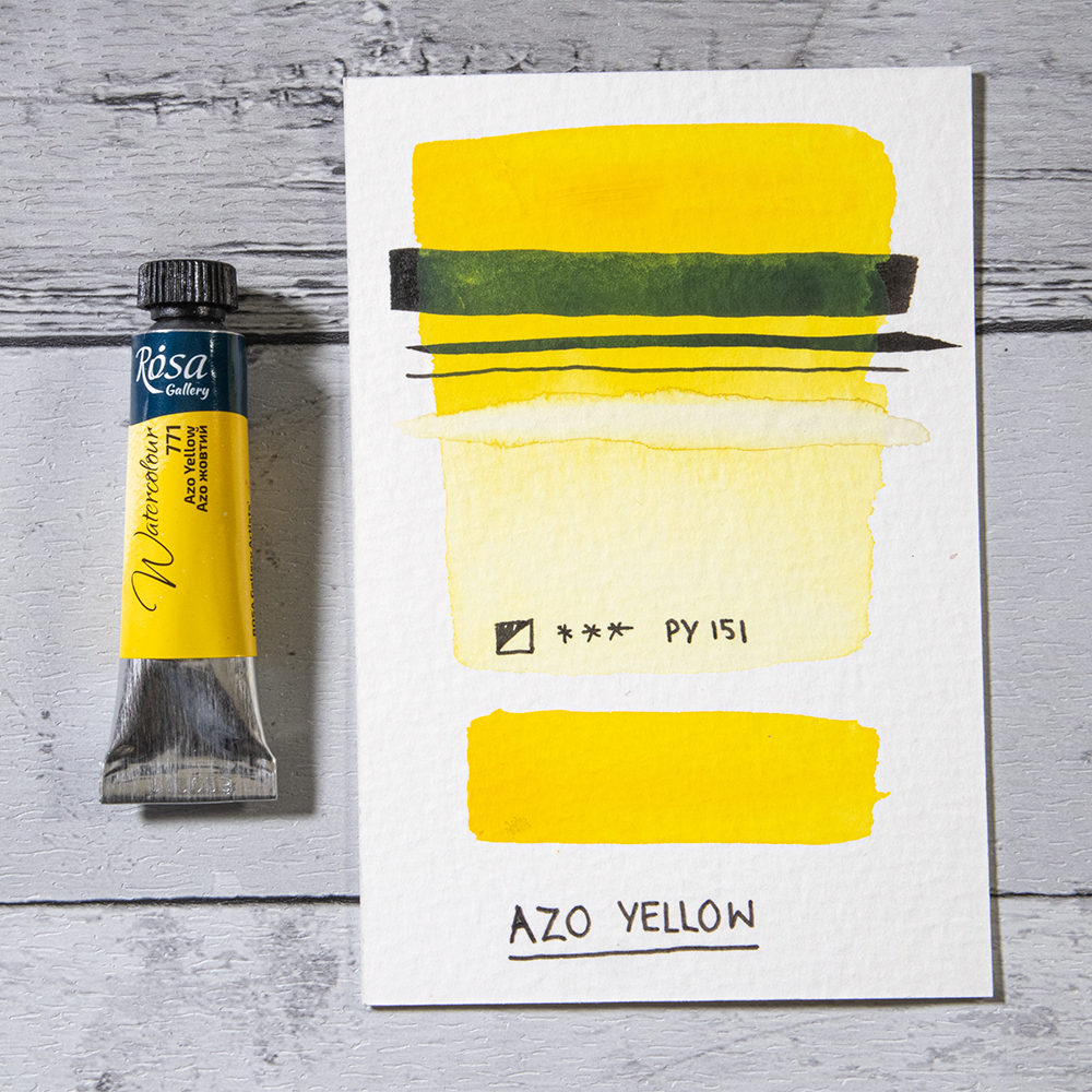
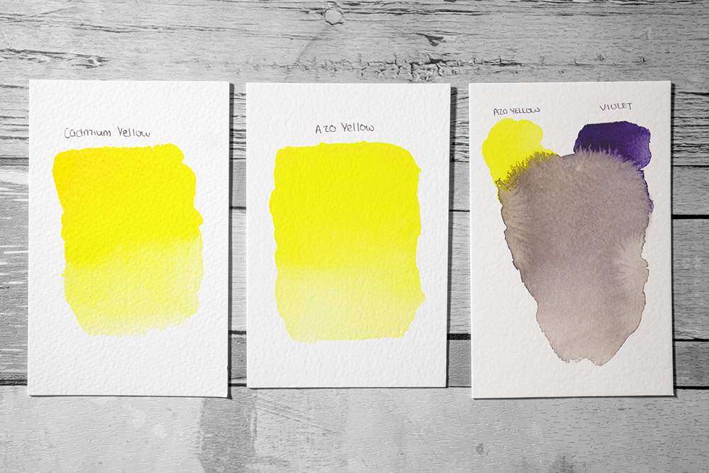
Azo Yellow is a bright and sunny yellow made from a single pigment, PY151. It’s a highly saturated colour with a semi-opaque finish and high lightfastness. It makes a fantastic primary yellow as its a universal mixer. It’s an incredibly versatile colour to have on your palette as it doesn’t overpower in mixes.
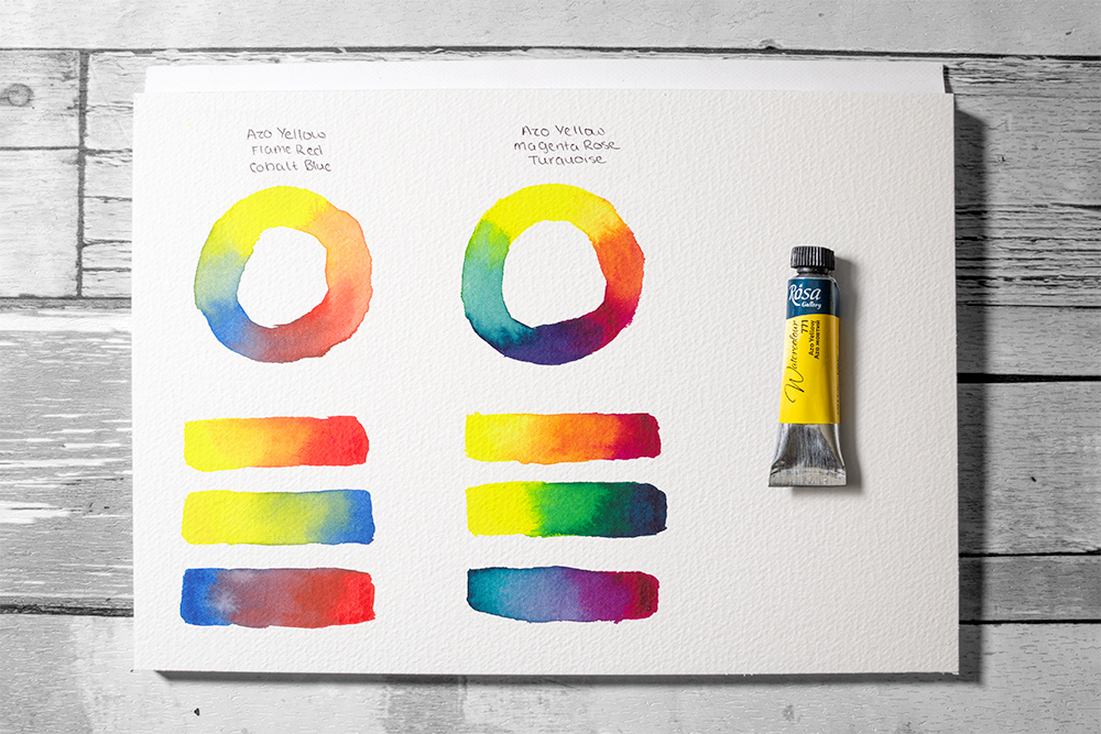
Try mixing it with violets to make some fantastic atmospheric greys. It also makes a great alternative to Cadmium Yellow if you’re looking to remove Cadmium colours from your palette. Zesty and radiant, this colour is sure to add the essence of light into your paintings.
Cadmium Orange Medium
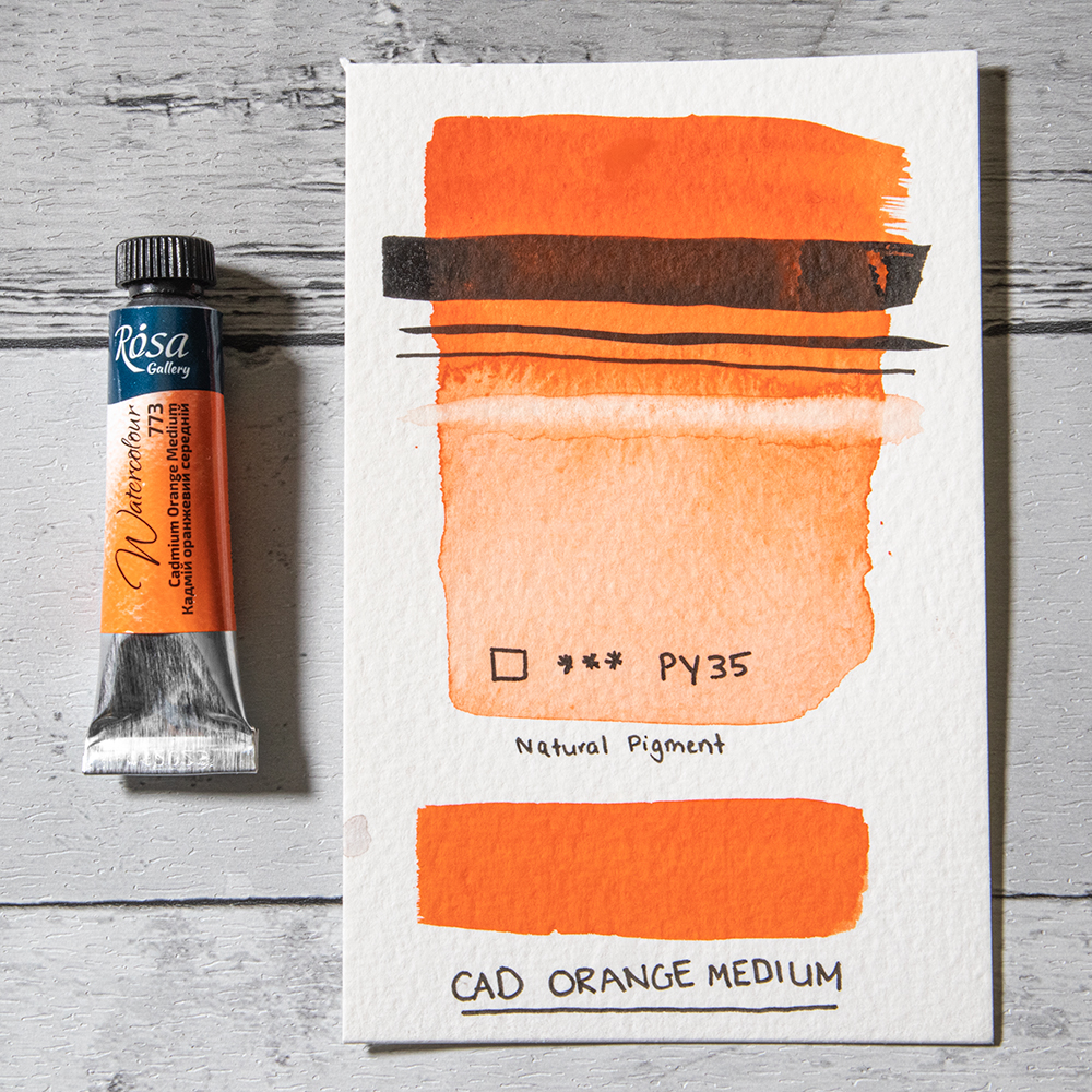
Made from a single pigment, PY35, Cadmium Orange Medium and has a richer, darker tone than Rosa’s standard Cadmium Orange. It opens up a new range of potential shades you can mix. Like the rest of Rosa’s cadmium colours, this orange is a bright, punchy colour with high tinting strength. Typically, Cadmium Orange is an opaque to semi-opaque to opaque colour, however Rosa’s offers a beautiful transparency. It’s a lovely colour for adding a bit of brightness to your botanical mixes, but can also be used to add a little radiance to sunsets and landscapes.
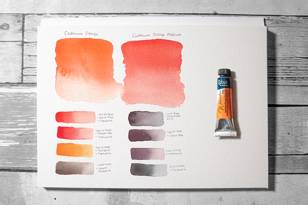
Cadmium Orange Medium Mixes with Cadmium Yellow Deep, Madder Red, Cadmium Yellow Deep and Cobalt Turquoise (left)
Mixes with Indanthrene Blue, Cobalt Blue, Ultramarine and Turquoise (right)
Cadmium Red Deep
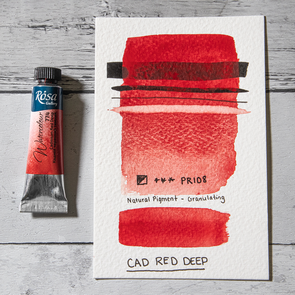
Cadmium Red Deep is made using a single pigment, PR108. This versatile colour is sure to be an indispensable addition to any artists palette. It offers high lightfastness, is semi-opaque and displays some subtle granulation. Cadmium Red is an incredibly popular colour, and this deeper variant is no exception. Its a beautiful colour to use alone, but also makes some fantastic mixes. Like other cadmium colours it has high tinting strength and good coverage.
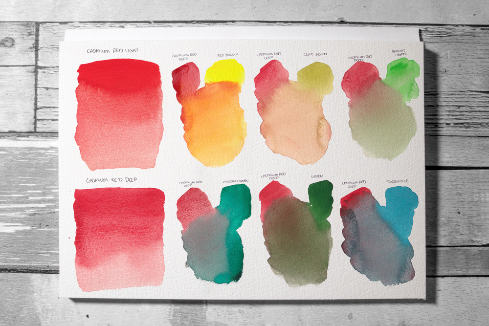
Cadmium Red Deep mixes with Azo Yellow, Violet and Bright Green (top)
Mixes with Emerald Green, Green and Turquoise (bottom)
Pyrrol Red
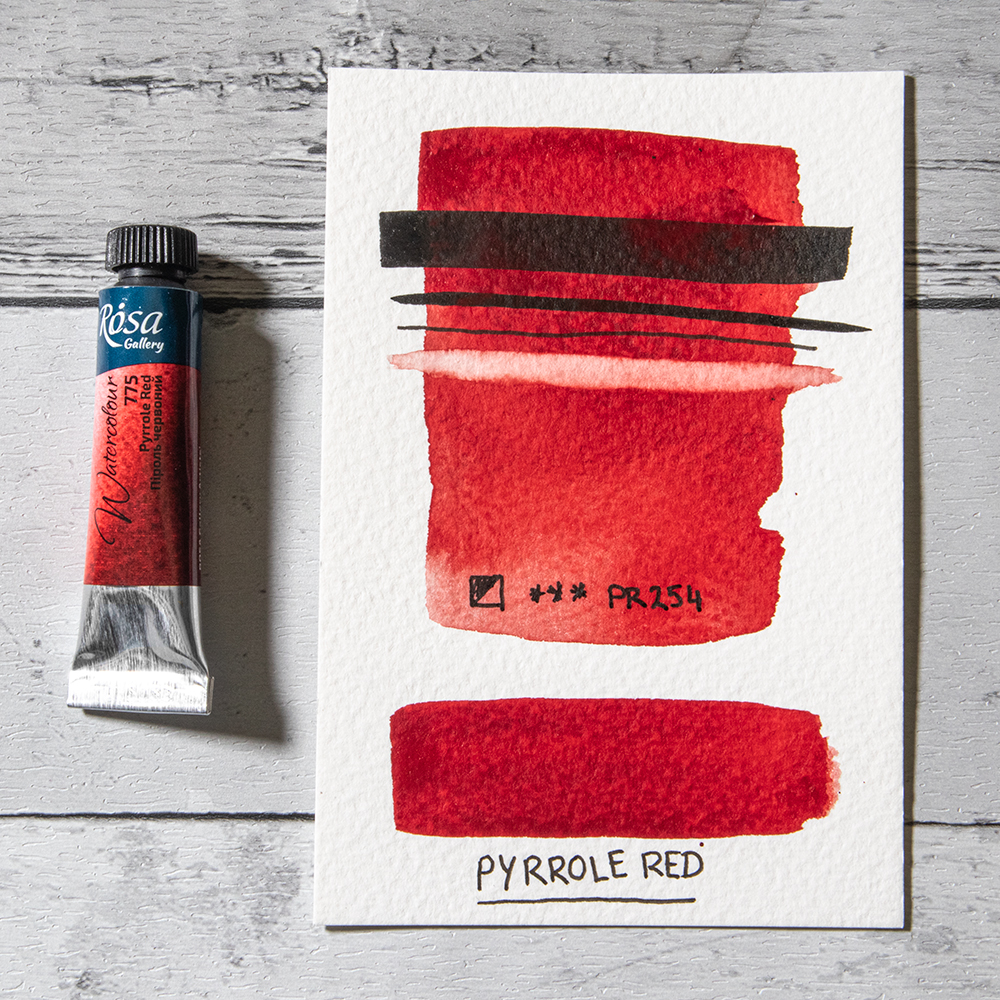
The term Pyrrol derives from the Greek word for fiery, and if you take Rosa’s new Pyrrol Red as an example it’s not hard to see why. This deep, saturated red is made from a single pigment PR254 which gives it a luminous red hue and offers excellent lightfastness. It makes a fantastic alternative to Cadmium Red but is more transparent and better for glazing. It’s a great mixer and is an incredibly versatile colour to include on any palette. Mix Pyrrol Red with any Phthalo colours to create a palette of rich, moody hues.
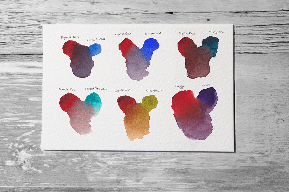
Pyrrole Red mixes with Cobalt Turquoise, Olive Green and Violet (bottom)
Cobalt Green Medium
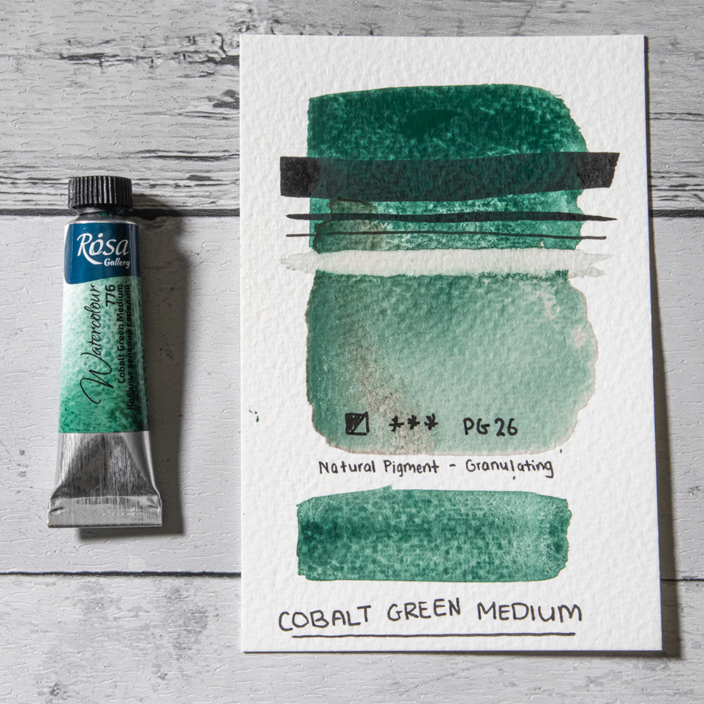
Cobalt Green Medium is a muted, low tinting colour that is highly granulating. It’s a classic colour that is semi-opaque and has a greyish undertone. Cobalt Green Medium is made using the single pigment PG26 and is an indispensable colour for landscapes. This colour’s granulating properties make it an excellent colour for landscape painting, but it’s also a great colour if you’re looking to add a little texture to you work. Mix it with Alizarin Crimson or Pyrrol Red to create a palette of atmospheric dark shades. You can also create an array of natural greens suitable for any landscape.
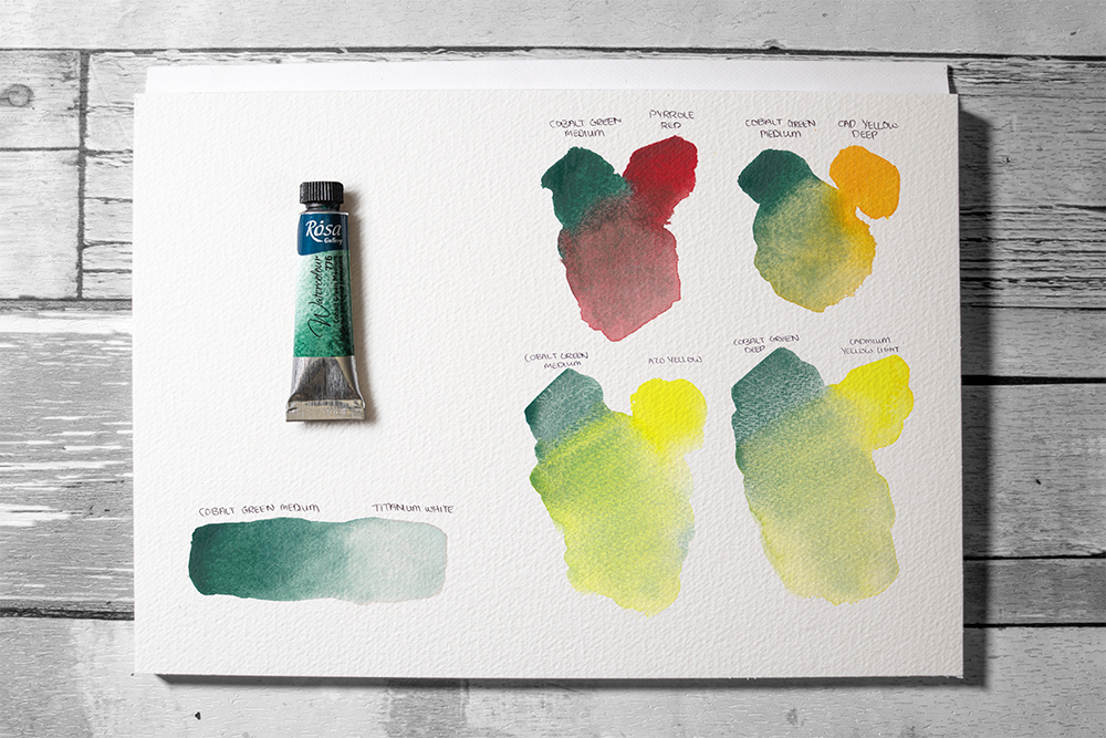
Cobalt Green Medium mixed with Titanium White, Azo Yellow and Cadmium Yellow Light (bottom).

Azure Blue
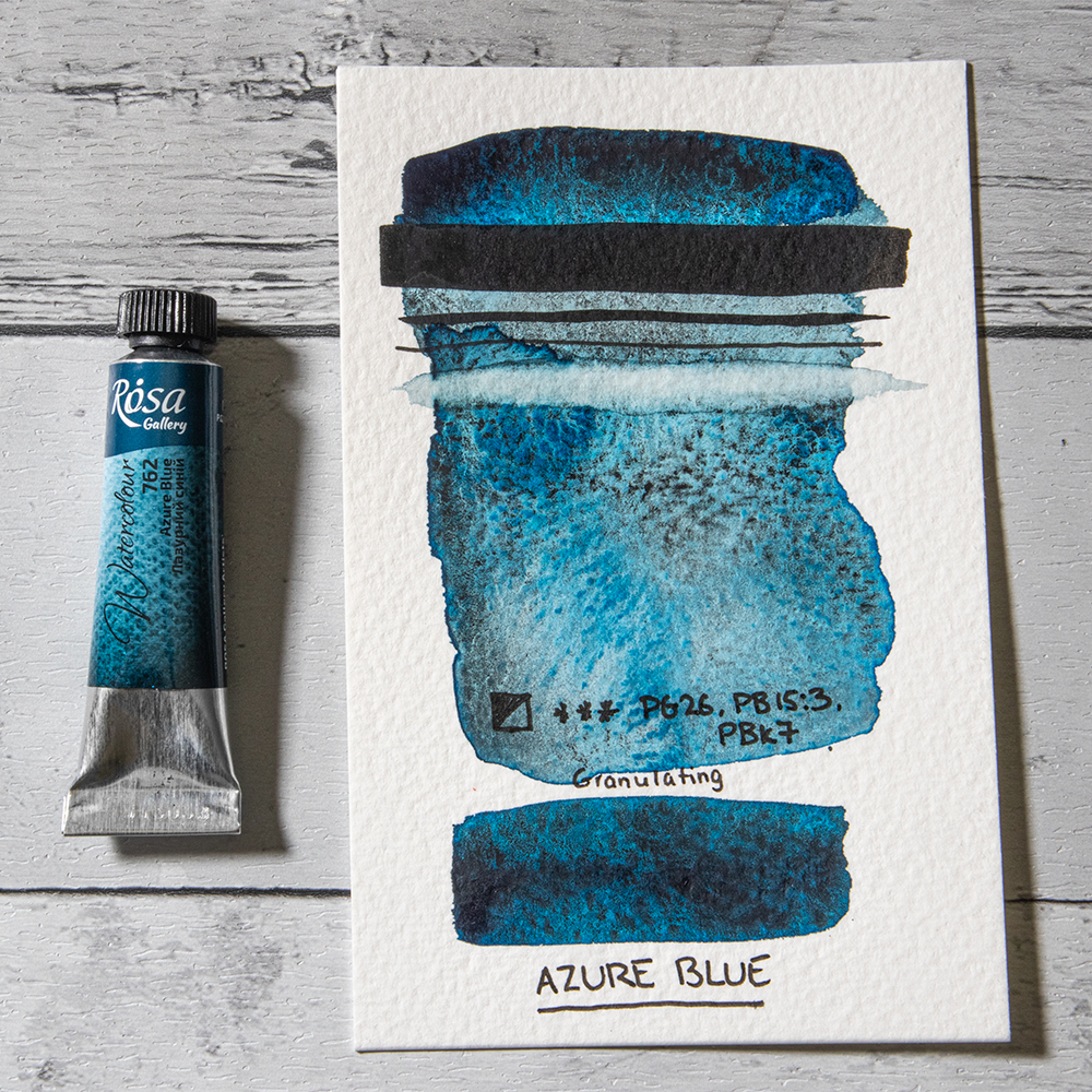
Azure Blue is a captivating colour made up of three pigments; PG26 (Cobalt Green), PB15:3 (Phthalo Blue Green Shade) and PBk7 (Carbon Black). It is a deep, saturated blue that granulates to form a mottled wash of interesting shades. Mix with a generous amount of water and you’ll see how easy it is to create the illusion of depth as its component pigments split to for a pattern of black, dark blue and turquoise. Although Cobalt Green is included in the mix it isn’t immediately noticeable, apart from its heavily granulating properties.
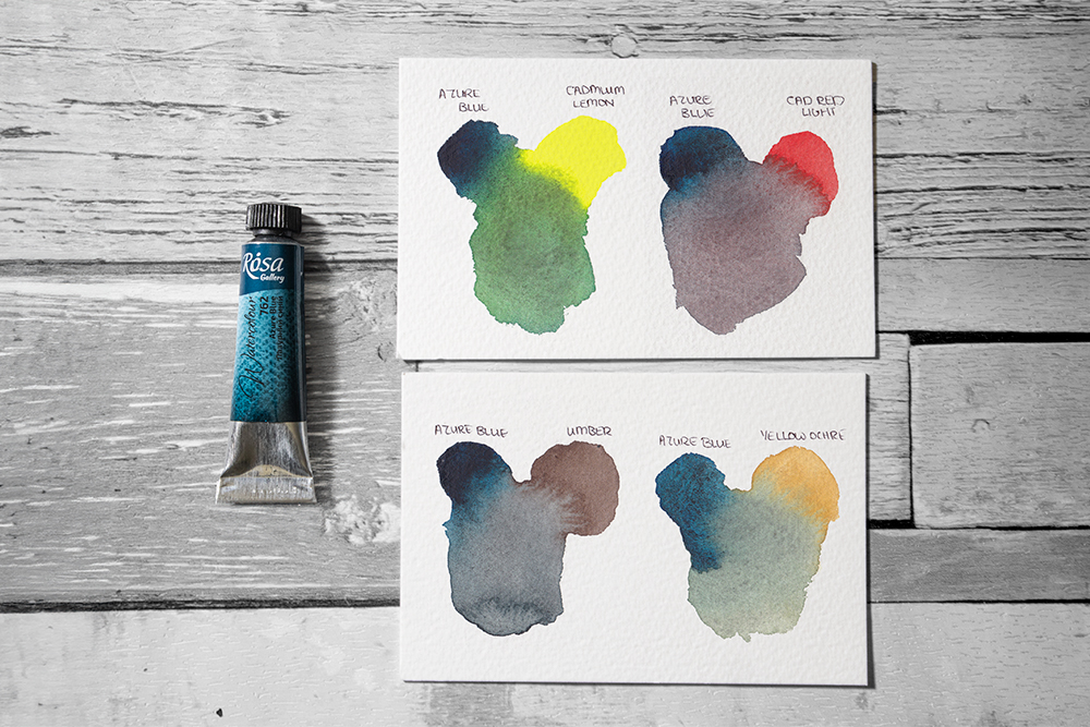
Azure Blue mixes with Umber and Yellow Ochre (bottom).
Ultramarine Spectral
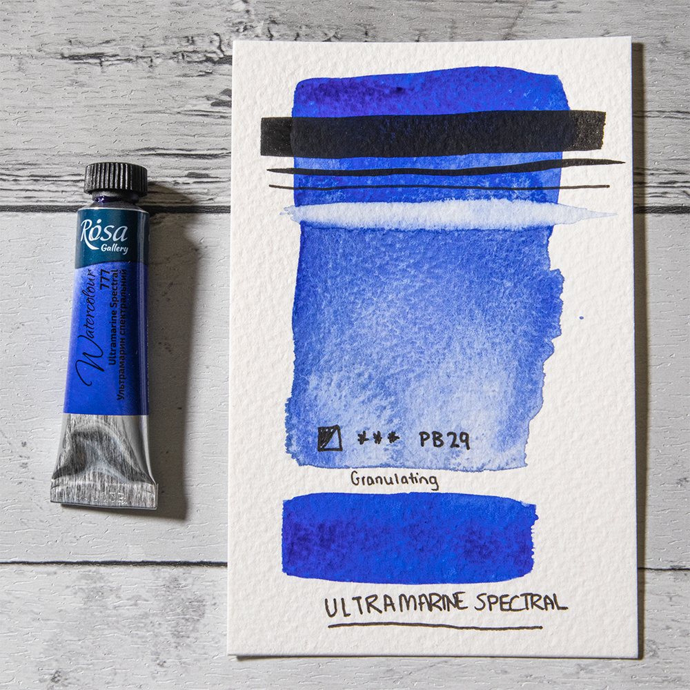
Ultramarine Spectral offers a warmer, more saturated blue than Rosa’s classic Ultramarine. The ultramarine PB29 pigment we know and love today was created as a more affordable alternative to historic ultramarine pigments that were made with lapis lazuli. This contemporary variant displays Ultramarine’s characteristic granulation and an enhanced warm, reddish-blue undertone. It’s a versatile colour that makes a particularly useful blue in a primary triad as it can create a useful array of mixes. If you’re a fan of Ultramarine you might find our Artists’ Pigments: A History of Ultramarine Blue an interesting read!
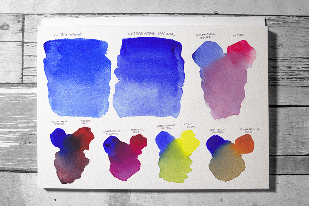
Ultramarine Spectral mix with Carmine (right)
Ultramarine Spectral mixes with Pyrrole Red, Magenta Rose, Lemon Yellow and Quinacridone Gold (bottom).
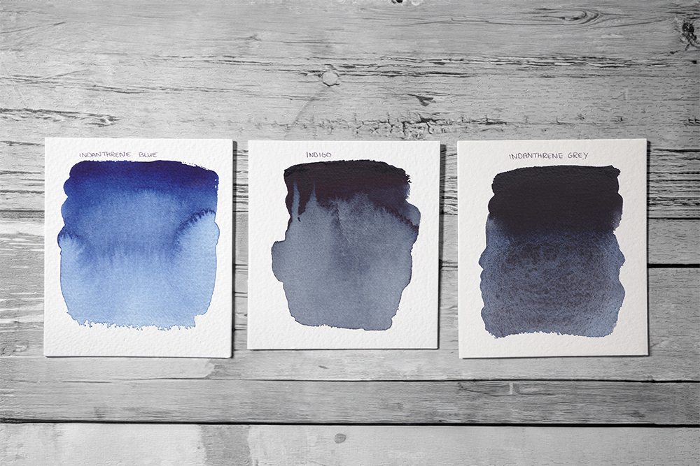
Indanthrene Grey
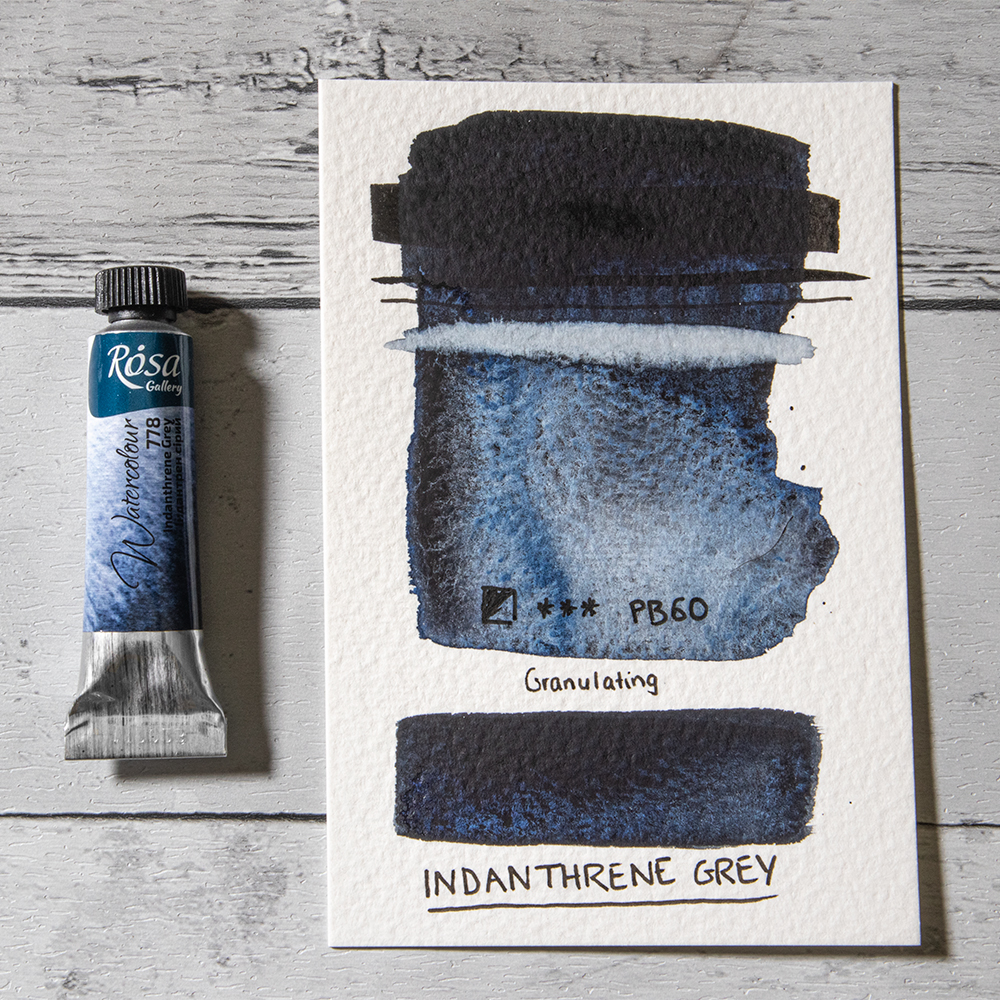
Indanthrene Grey is a deep, complex colour that is sure to win over fans of dusk and twilight shades. Made using PB60, it’s a rich blue black that is much darker than the Indanthrene Blue it shares its pigment composition with. It’s almost black in mass tone, but dilutes into washes of wispy blue-grey. It offers a colour similar to Indigo, however unlike Indigo it shows some beautiful granulation.
It’s a particularly useful colour for painting shadows, but can also mix with yellows to create muted green shades ideal for landscape painting. Try mixing Indanthrene Grey with reds and you’ll discover a palette of rich, deep violets.
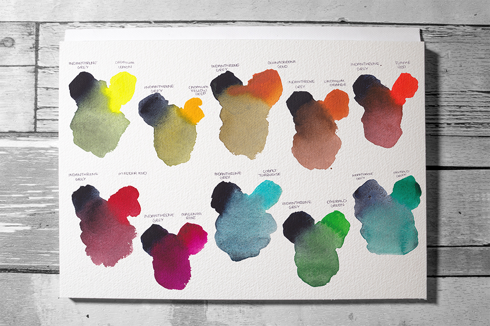
Indanthrene Grey Mixes with Madder Red, Magenta Rose, Cobalt Turquoise, Bright Green and Emerald Green (bottom)
Golden Ochre
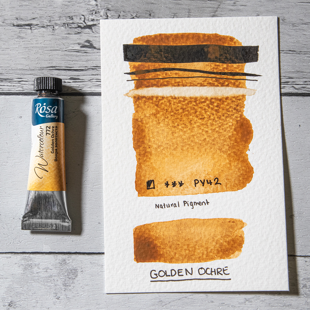
Golden Ochre is a warm brown based on the pigment PY42. This soft golden shade is beautiful enough to use alone but it can also add a warm, neutral tone in colour mixes. The subtle glow of this colour is perfect for adding a dash of dying light to twilight skies and is also incredibly useful for landscape artists. Mix it with almost any green and you’ll be greeted with a palette of muted natural greens perfect for landscape painting.
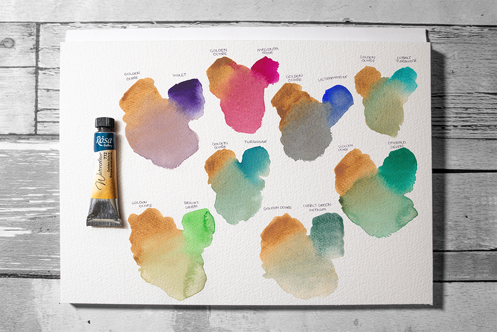
Golden Ochre mixes with Bright Gren, Turquoise, Cobalt Green Medium and Emerald Green (bottom)
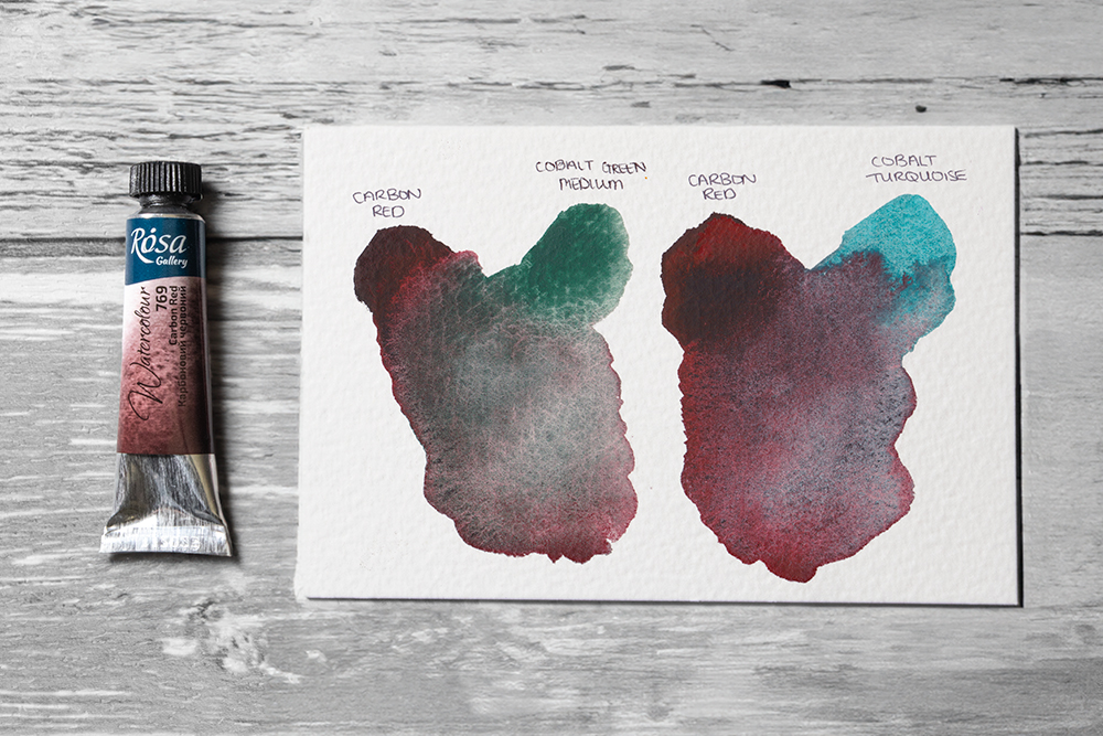
Carbon Red
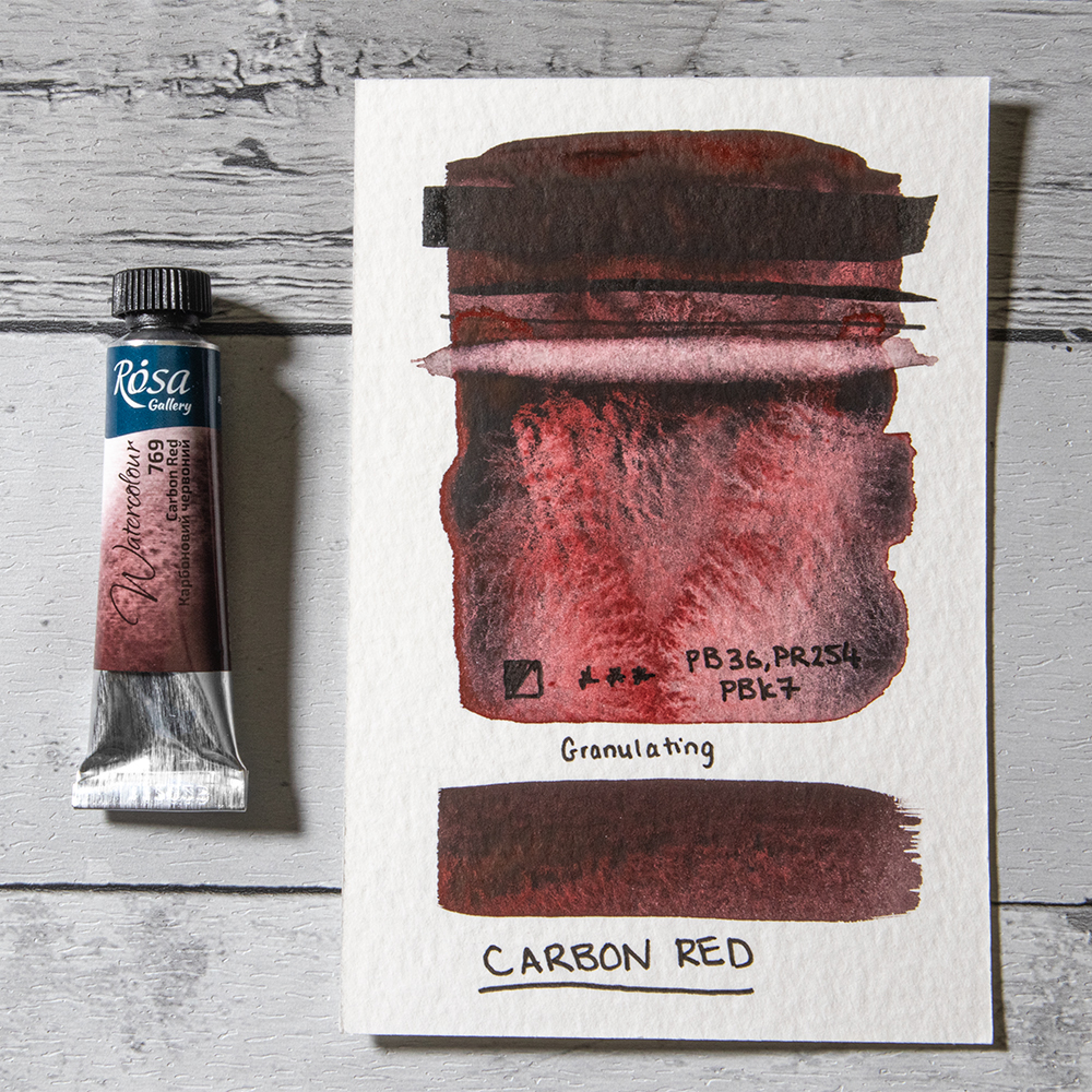
Carbon Red is a beautiful combination of PB36 (Cerulean Blue Chromium), PR254 (Pyrrole Red) and PBk7 (Carbon Black). Although this colour may look black straight from the tube, all it takes is a little water to release a vibrant, rich red. Paint it in a wash and you’ll see a warm red-black colour that produces a marble-like glaze of granulation patterns. The more water you add the more you’ll see the pigments split, creating areas of rich red, mottled black and muted violet. Its a brilliant colour for capturing natural textures like rocks and mountains as it has an almost volcanic quality. It’s great for abstract work too.
Dive into a world of colour with these new Rosa Watercolours
These new additions to the Rosa Watercolour range are sure to excite many watercolourists – there’s something to please every palette. The beauty of each of the new colours certainly shines through, but combine them with the rest of the Rosa range and you’ll see just how versatile they can be. We’d love to know which of the new colours you’re excited to try!
If you’re new to Rosa Watercolours and would like to know more, check out our blog post Introducing Rosa Gallery Ukrainian Watercolours for a great overview of the range.


I love watercolours look good new 10 of tube how much for all new tube thank Andrew
Hi Andrew. Happy to hear you like the new colours! Rosa Gallery 10ml Watercolour Tubes are currently £3.40 each, so all 10 colours would cost £34 – plus postage depending on which other items are on your order.
Hiya Tanith, thanks very much and a really great post.
I haven’t tried Rosa Gallery Watercolour yet, buy I have just put the two dot cards on to my order to try out.
I suppose that I’m like a lot of people in thinking of the low cost/quality ratio, but that’s because most brands cost much more.
I keep looking at a couple of the Rosa sets that really interest me and maybe trying a set or a tube set may inspire my creativity?
Take care, David.